

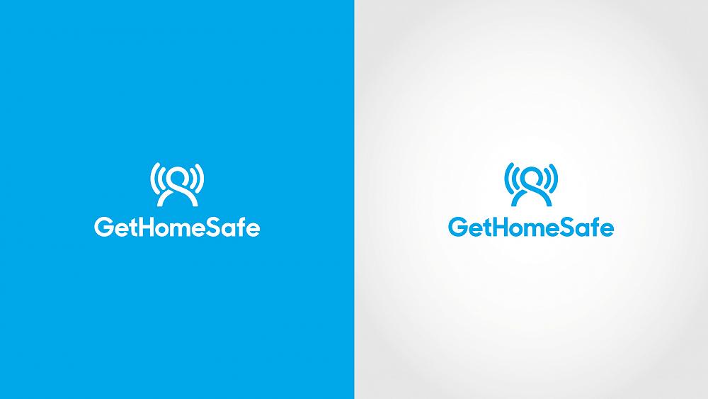
The brand refresh pays homage to the original GetHomeSafe brand with the inclusion of the icon of a person, but rather than using the original angels wings approach, we have incorporated icons that depict a signal or an alert to go alongside the person. The new brand is modern, timeless and designed to be bold and clear on a user interface.
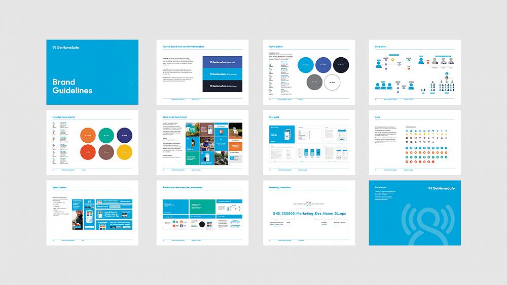
Supporting the new brand is a comprehensive set of brand guidelines for consistent use of the brand going forward as GetHomeSafe continue to grow and expand across the globe. The brand guide includes their tone, logo usage, image use, typography, brand applications and examples; and also includes UI/UX principles for the website and dashboard applications.
The next phase in the GHS journey, which is currently under development is the prototyping and design of their new user interface which will be a completely fresh, new approach - one that our team is excited to share with the world. So stay tuned!