

Just before lockdown under the new management of Malina Daulton, they decided to rebrand and completely update the logo and corporate identity. The current brand was tired and aged, and it was time to give their brand some love. The fresh view and image was the main condition for the new identity whilst also maintaining the brand awareness that The Strictly Coffee Company have built over the last 20+ years.

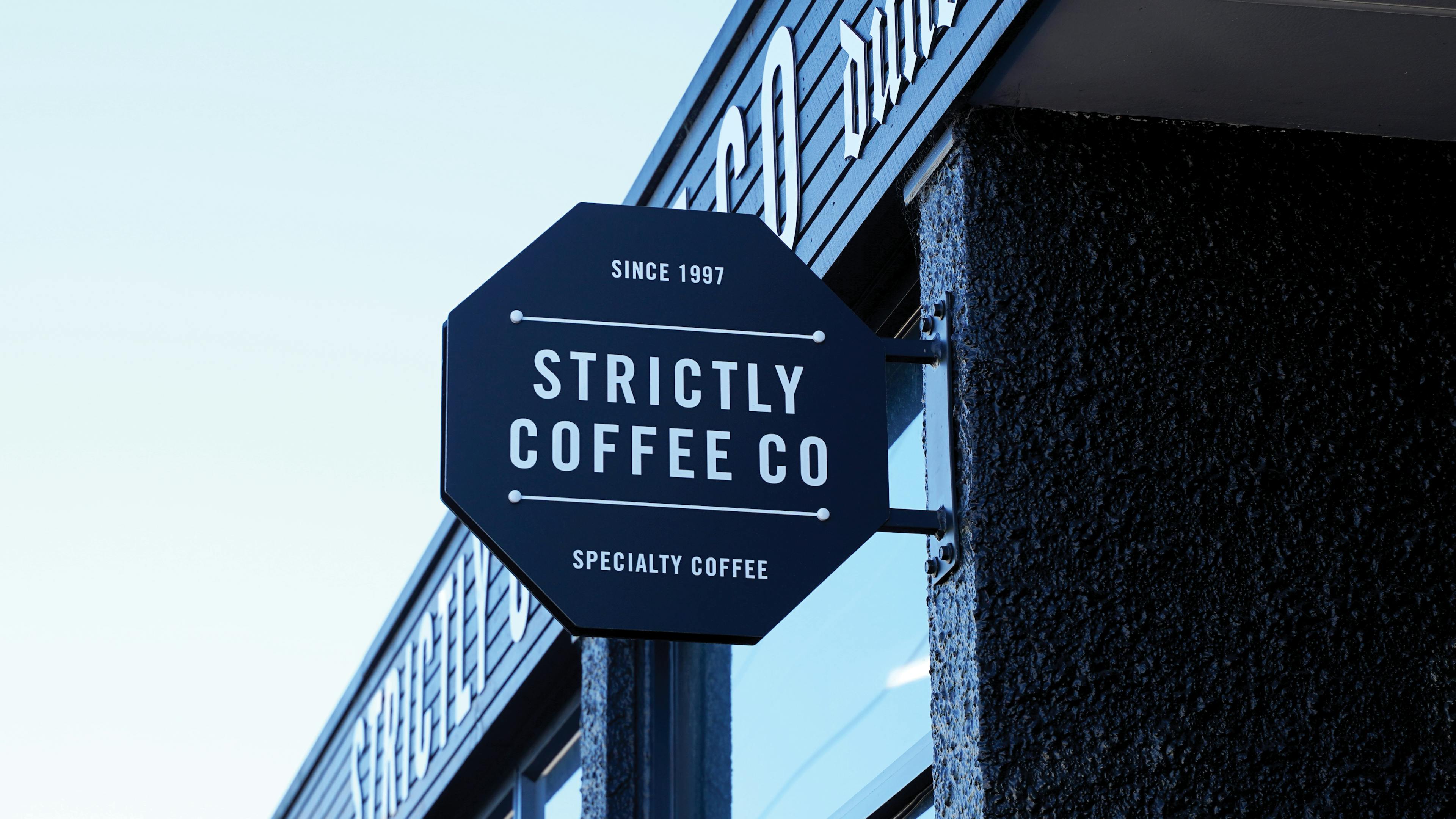
The coffee beans — is a previous company’s logo. In the process of rebranding, we decided to abandon this typical coffee symbol in the logo and focus on "keeping it local". The octagon symbol connects with the 'Dunedin Octagon' which is important as is a hyper-local Dunedin brand. It also includes 'since 1997' which is a point of difference for Strictly and positions them as a slightly more 'mature' coffee brand in the market. In the new identity, we decided to reduce the palette significantly. Chose a black for the main brand colour and a unifying copper colour used for emphasis and to add a bit of something special to the new brand.

Along with the logo we developed the design of the coffee packaging and a Shopify website www.strictlycoffee.co.nz that incorporates the new branding and makes it easier than ever for all the coffee lovers out there to get their favourite local coffee.