
In the past few months, we have been lucky enough to be a part of the conception of a new business and sub-brand of Landpro, GroundHQ.
We were able to put our collective minds to good use throughout the process, armed with a design brief, workshop outcomes and an understanding of the business evolution ... we brainstormed ideas to capture the essence of their new brand and unique selling proposition.
We also understand that a brand is more than just your business name or logo. More than just your company image or positioning tag line.
It’s a successful combination of value, product, service, personality, image, logo, promise ... and customer experience! An effective brand needs to be original, memorable, unique, and have a lasting impression!
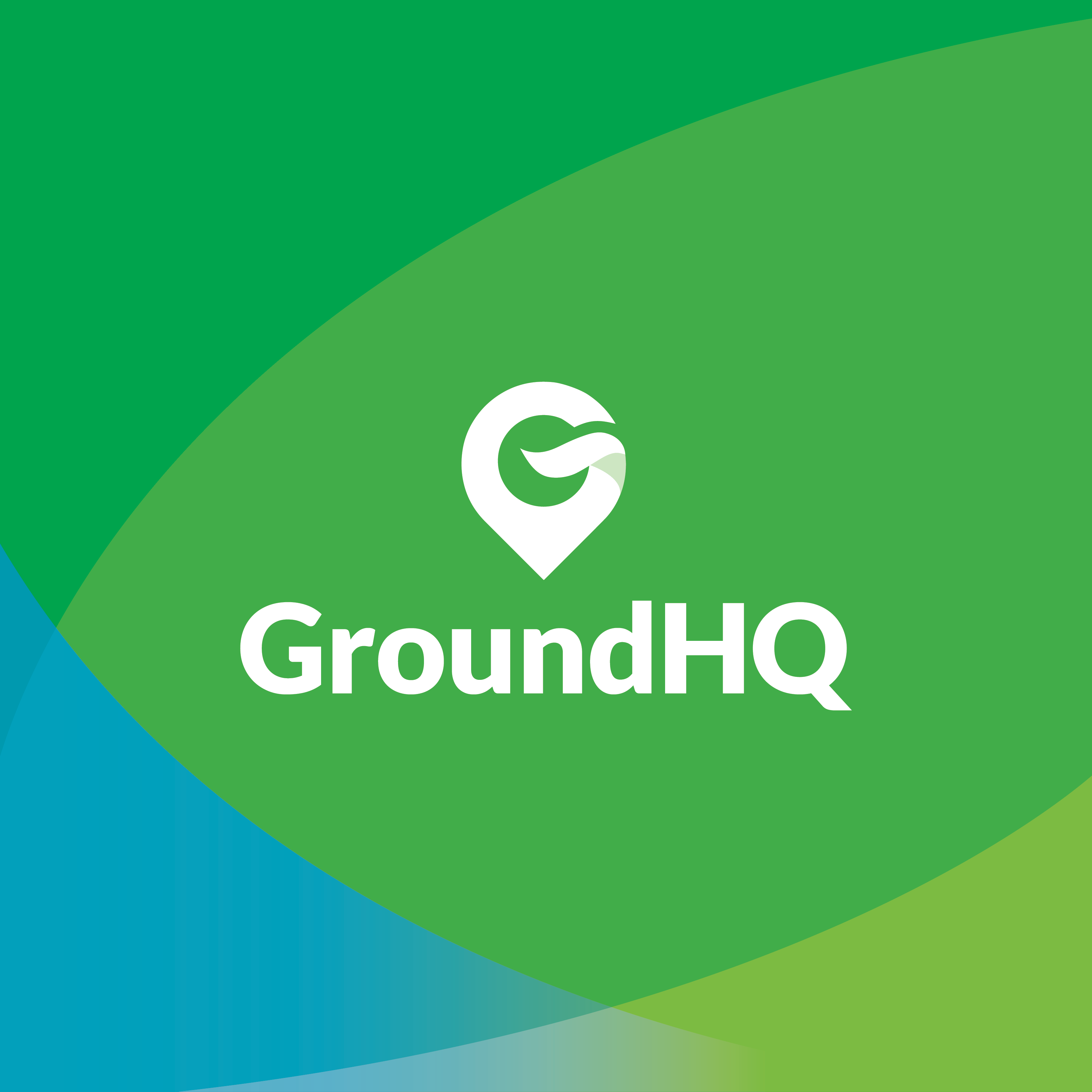
Ultimately the crowd favourite was the name GroundHQ which aligns perfectly with who they are and what they do. The brand name encompasses the strategic environmental advisory services they offer for the agricultural, food and fibre sector, in a simple and effective way.
Our talented Graphic Designer Taryn Ormsby then translated this into the brand design, which has a three-fold meaning. It represents GroundHQ as a physical location and place to go for strategic environmental and agricultural advice, research & development opportunities. The symbol also depicts the letter G, with the return of the letter as a wave to represent water, and the primary colours green and brown representing the earth, environment, agriculture and pastures.
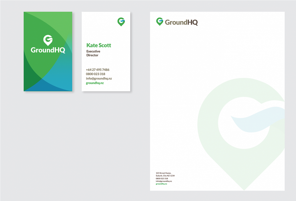

Once the naming and branding projects were complete our front end designer Louis Fiddy was able to bring all of the elements together in the creation of GroundHQ's landing page - groundhq.nz, presenting all of the relative information, branding and imagery in a captivating & clean website, and the end product is maximum effect with minimal space!

