Social media is not a one size fits all. What may work on Instagram visually may not be very effective on LinkedIn. The layout of the images can change, which can completely change how your post will look. Taking the time to curate what works best for that platform will make a difference and help to elevate your social media presence. Here is some advice for curating different types of feeds ??.
Facebook visuals look the best as squares. We recommend posting either one image or a group of four images, as this effectively uses the available visual real estate and sits nicely in the feed.

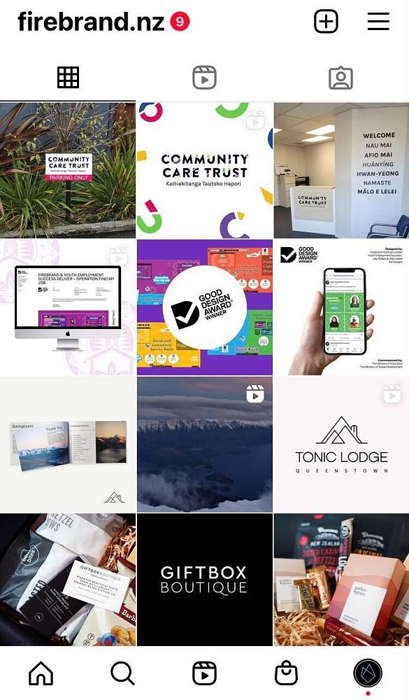
Instagram
Our recommendation with Instagram is to keep things visually consistent when someone clicks on your profile. One way Firebrand has been doing this is by posting three separate posts at the same time for our projects. When you click on a profile, this takes up an entire row and immediately highlights a project/event/value for someone visiting your profile.
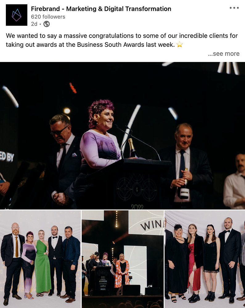
The visuals should not be ignored on LinkedIn. LinkedIn does have an interesting layout for when you post multiple images. You should be aware of this because it can lead to weird cropping. ? Two images are cropped to be two skinny verticle rectangles. Posting four images will have one large tile cropped as a horizontal rectangle, and the other three images will sit underneath as squares. If you are posting five images, they will be cropped as squares, two large ones on top with three smaller squares underneath.